Starbucks Benefits

Objective
Create new branding and an initial launch campaign for benefits open enrollment. As part of an evolving internal communications strategy, a new design approach is needed in order to breakthrough and reach an audience of part-time employees across North America.
Solution
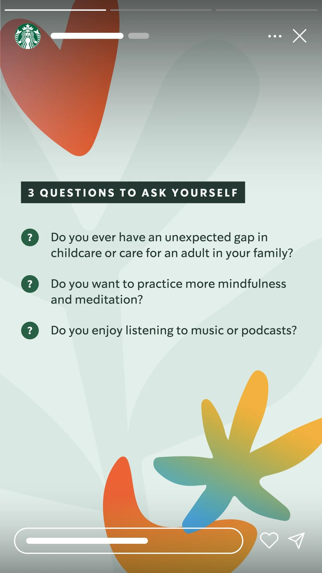
A youthful, fresh, engaging design system that’s both beautiful and functional. It was important to fit within Starbucks overall brand expression, but stand out in key ways so the benefits platform could own a unique identity. Abstract shapes and an expanded color palette represent categories of benefits offered, and the design system was developed to meet the needs of various print and digital applications.
For over six years, I have developed and art directed dozens of small- to large-scale campaigns since the initial Starbucks Benefits brand launch. Thinking not only about the initial campaign, the design system was built to last, growing over the years to set the standard across all benefits communications and future campaigns.
Team
Brenden Mendoza, art director
Andrew Vagner, art director and designer

Visualizing the aspects of well-being.
A critical part of the concept phase was the time spent exploring shape language, pattern, and color to represent all the offerings within Starbucks Benefits. The process resulted in a range of ideas, from typographic explorations to the more conceptual and organic elements that became the core pillars of the design system.


An enduring design system.
Over the years, the system has helped strongly identify communications and campaigns regarding Starbucks Benefits. From the annual open enrollment window to evergreen retail benefits campaigns to new benefit announcements, the system has been a cornerstone for consistency and recognition.